These are the images I produced by editing the photographs. I like that there is more of a depth to these images rather than being just 2d.
I wanted to revisit "journey'', above I have cut out a world map stencil and coloured using ink.
Here I have added photos of Bristol harbour to give a sense of how boats from it carry trade and industry around the world.
Here I have desaturated and added text, however I feel the colour one describes Bristol more.
Found Alphabet
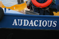
Walking around Bristol Harbour I've found a lot of interesting boat names. This has given me the idea to create an alphabet using individual letters from the names of boats. I am going to try and look for interesting weathered and rusted letters to give a nautical feel.
Continuation of Drawing
This a drawing I did depicting a conversation in the pub. I stuck to the rule of using one continues line I feel this effect worked reasonably well. I'm going to continue editing this image maybe making it more abstract and trying to add colour.
Absorbing the atmosphere of a place
This image is part of an argument in the pub, I made it more basic using one continuos line. i feel this approach gives more impact, I'm going to try further this idea working in the same style.
A Sense of Place
For A Sense of Place I decide to use one of my photographs that portrayed the shipping industry, the way the harbour was built and how it feels to walk through the parts that remind you of the past. I drew into this photo using tea, ink and paint to create an old oily effect. I feel the above image works well to portray a sense of place and may use this as my final piece.
In this image I used a photo of a tree from the harbour, I don't feel this portrays a sense of place very effectively. However I like the way the twisting trunk of the tree reminds of the river in the harbour map, I may use this image for 'A Journey'.
Drawing task
The two images above are line drawings we practiced in the studio. The drawings we did followed certain rules such as not taking your pen of the paper and only drawing straight lines or curves. what i noticed was that the drawings that followed rules turned out more stylized, bold and were often a lot more interesting than the ones that didn't. Im going to try and use these sort of rules in my later drawing.
Journey
I have thought about how I could portray a journey. I have decided to try out using old world maps and modern Bristol Harbour maps, I have done this to make a comparison about how Bristol Harbour used to export goods around the world, but now is almost purely for leisure.
I don't feel this piece above works yet, mainly because it doesn't really say Bristol or show a comparison of modern and new. I am going to try and approach this idea in a new way maybe using images with the maps.
I don't feel this piece above works yet, mainly because it doesn't really say Bristol or show a comparison of modern and new. I am going to try and approach this idea in a new way maybe using images with the maps.
Bristol Harbour Trip
I have been to Bristol Harbour to research the area for series of post card size images I'm going to create. I used photographs and sketches to record ideas, patterns and textures. I'm going to keep working with above images by scanning them onto to photoshop and also drawing into them by hand etc. I'm going to be trying to create a sense of place and journey, also a poster of found type and about absorbing the atmosphere inside e.g. pub or restaurant.
Subscribe to:
Comments (Atom)


