I decided to revisit the map stencil images and make the photographs more prominent. Also I have printed these straight onto brown paper i think these images are more successful to the ones prior.
I wanted to revisit "journey'', above I have cut out a world map stencil and coloured using ink.
Here I have added photos of Bristol harbour to give a sense of how boats from it carry trade and industry around the world.
Here I have desaturated and added text, however I feel the colour one describes Bristol more.
Found Alphabet
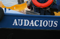
Walking around Bristol Harbour I've found a lot of interesting boat names. This has given me the idea to create an alphabet using individual letters from the names of boats. I am going to try and look for interesting weathered and rusted letters to give a nautical feel.
Continuation of Drawing
This a drawing I did depicting a conversation in the pub. I stuck to the rule of using one continues line I feel this effect worked reasonably well. I'm going to continue editing this image maybe making it more abstract and trying to add colour.
Absorbing the atmosphere of a place
This image is part of an argument in the pub, I made it more basic using one continuos line. i feel this approach gives more impact, I'm going to try further this idea working in the same style.
Subscribe to:
Posts (Atom)


